
Let's talk color.
As I have taken more steps into the realm of what it means to be a commercial photographer I have constantly been faced with this issue of ambient light. Ambient light is all that light that's around your subject in the real world that just kind of is there. Often this ambient light comes in at different temperatures, which I am just going to call it as colors. These different colored ambient lights screw with the final color of the photograph you take. This may seem obvious, but I have spent many hours color correcting or "color grading" photographs that I receive for graphic pieces. Whether it is out of lack of care or just not knowing any better, I am regularly presented with photographs that have yellow or amber whites, red blacks, or green mid-tones.
It's important to remember that commercial photography is not shooting for Instagram and Facebook likes. Typically commercial photographs are meant to be the most simple form of communicating a product. A good product photo will need no more than a sentence to tell you all you need to know to want it. Product photographs are meant to be true representations. If you are planning on shooting product you must understand that showing the viewer as best you can the color and quality of said product is everything to most art directors and marketing directors. If you cannot give a pristine representation of that new, let's say, bottle of perfume you have failed that commercial assignment. This goes for food as well. Food stylist are so into detail it's maddening. For you as the photographer to mess with that precision is just bad work.
Pro tip: If you can, get your color correct before the shutter releases and before the editing process.
In the modern day of digital cameras we are dealing with three colors. Red. Green. Blue. These are the colors of the pixels on your screen. These three colors in combination create all the colors you expect to see on a screen. Even before seeing your image on a screen the sensors in your cameras are locked on to separating red, blue, and green into the proper ratios. I think understanding this idea of ratios is important for understanding color reproduction, and really that's what I want to talk about. Color reproduction.
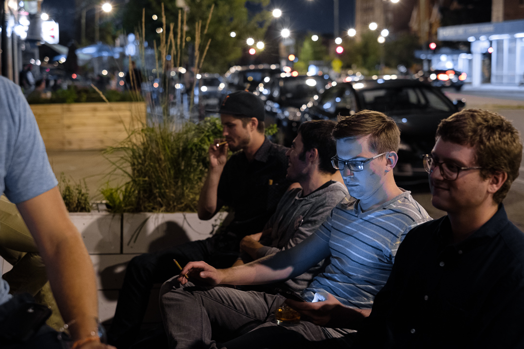
All the light sources are contributing their own colors to mess up my camera's auto white balance...
White balance.
If you've spent any time with a RAW photo editor such as Lightroom or using a digital camera you have seen something called white balance. Think of this setting as the base line, the constant, for the all of the color that will come out of the camera after actuating it's shutter and processing that ratio of red, blue, and green pixels. If the camera is detecting or is preset to determine "white" as more yellow, green, magenta, or blue it will sway the ratios in that direction. In real world scenarios we can think of this as the effect our own optical processes have (cones and rods and optic nerves and brain stuff) as we walk from outside on a sunny day into one of those gyms that has that strange orange light. If you spend enough time in the orange light gym your brain will compensate and begin shifting all the colors so that the colors you know to be are being perceived as that color. White balance, be it in film or digital, is this concept for photographs; still or moving. Typically digital cameras will have presets that show themselves as icons to simplify this adjustment up front. These look like a "sun," "clouds," "fluorescent tube," or "incandescent light bulb." Each is supposed to reflect the ambient lighting conditions. You would select from these presets depending on the situation you are shooting in. This might be in day light outdoors (the "sun" icon), in an office with that droning fluorescent hum (the "fluorescent tube" icon), or in a space with hipster Edison bulbs (the "incandescent light bulb" icon). By selecting from these options you are telling the camera what temperature, what color, the light is so that "white" is seen as white instead of, say, orange. Digital cameras typically make this process either more involved or less involved with automatic white balance detection and manual temperature adjustment. The manual temperature adjustment is typically denoted by a "K" for Kelvin. Kelvin is a unit for temperature. Typically you will have forgotten what Kelvin is by the time you have finished high school, so I am reminding you. This manual adjustment of white balance is useful when you are in a situation that the camera is being confused because the ambient light in your scenario is actually a combination of "sun," "fluorescent," and "Edison bulb." Basically though, auto will do just fine. Simply having a better working knowledge of light temperature and how it affects the reproduction of color in your end photograph is going to be a game changer in your shooting. Be you a hobby shooter or pursuing a career as a photographer.
Now, for the more advanced shooter that is insisting on shooting and editing RAW files, I implore you, learn how to first read light temperature before hitting that shutter button. It will spare you much annoyance in the editing process. If you can't control the color of ambient lights in your scenario, you are in luck. RAW file editing allows you to adjust your white balance in post. Some of you are rolling your eyes because this is feeling like some amateur hour stuff right here. Believe me, I actually feel similarly a lot of times when I am being sent photographs from people that obviously don't understand this stuff. That's why I typed up all these words. There are still people out there that don't get it.
Photographers, let's be real for a moment. Your camera's auto white balance setting is probably real good, but it's only as good as the information that it's receiving. If you do the work up front to correct the color of your light as best you can, your camera will help you along the rest of the way.

This is an image I received recently for use as a promotional piece. I did not shoot this image.
Color Balance
There are a number of uses for Photoshop. One of the ways I use it most is for color correction or color grading. There is one particular adjustment layer in Photoshop that I immediately go to when I have to deal with color correction. Color Balance. This adjustment layer shifts the color reproduction separately in the highlights, mid-tones, and shadows. In the image above I decided it would be easier for me to correct this white balance issue in Photoshop rather than in Lightroom. In reality this image could have been shot under more controlled settings so as to have accurate color from the start. It's tricky however when you are shooting on location with your ambient light coming at you in 5 different colors. Now the image above with my adjustments aren't perfect. It's a little too blue in places, but with JPEG compression and moving to the web color profiles are all over the place and I wanted to get the edit done with. I happen to think colors are at least more correct. I know this because I know that the plate that sandwich is on is a pretty bright white. I also painted that wall behind the cup. It's not a greenish gray. It's closer to a blueish black.
Back to Color Balance. The way this tool works is by isolating the blend of the three major color channels in either the highlights, mid-tones, or shadows. In each selection there are three sliders that all start in the middle at 0. The three sliders are Magenta/Cyan, Green/Red, and Yellow/Blue. The sliders depending on the mix of the three will aid you in adjusting your color corrections. I like the Color Balance tool because of the ability to really fine tune but also create some neat colored photos.
This process is often referred to as Color Grading. Folks in the film industry specifically use this terminology. In films it's less about color correction than it is about creating an aesthetic or mood through the application of color.

This photo's color was purposely adjusted to bring out pinks and blues. Achieved through the Color Balance adjustment in Photoshop.
In conclusion...
I guess all that to say. I just want to stress the importance of understanding color reproduction in commercial photography. in particular food and product images. Please take the time to account for the color of ambient light. Please take the time to assess the ways you might prevent off color ambient light from entering your photograph. This could also be my argument for controlled light sources. Strobes and similar studio lighting...
The final product.